
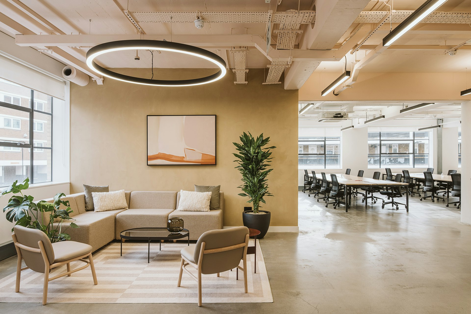
The Bridge Group sought a bold and unique office environment that blends modern aesthetics with functionality. Intending to create a CAT A+ space that would appeal to prospective tenants, we designed a space that stands out from typical office spaces in the area, with an emphasis on a vibrant, creative design that reflects the client’s passion for innovative interior design. Influenced by the building’s distinct shape and curvature, we designed this space with a strong sense of dynamism. Our goal was to create an environment that feels bold yet refined, setting the tone for a modern office that is both functional and visually unforgettable.
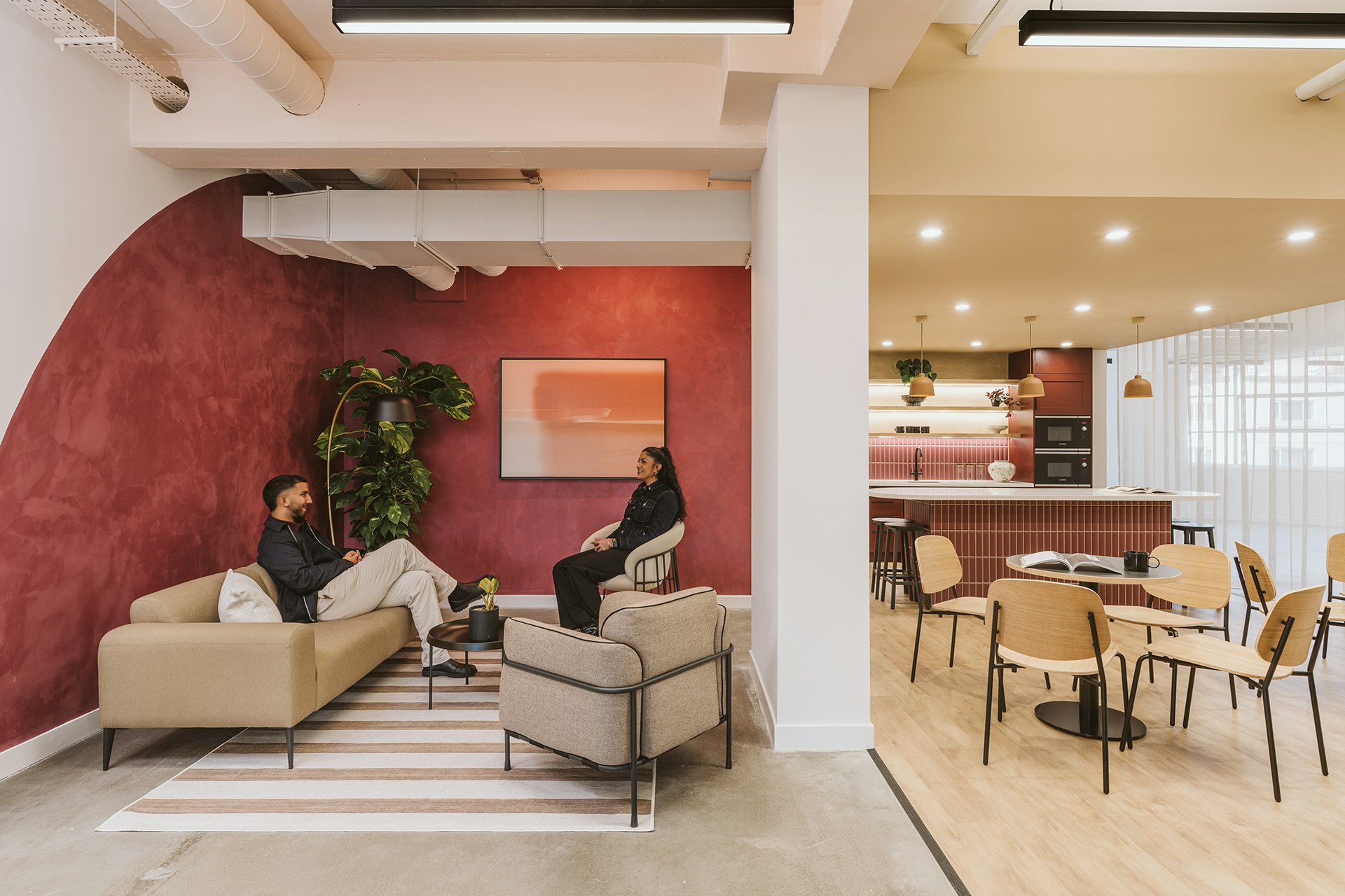
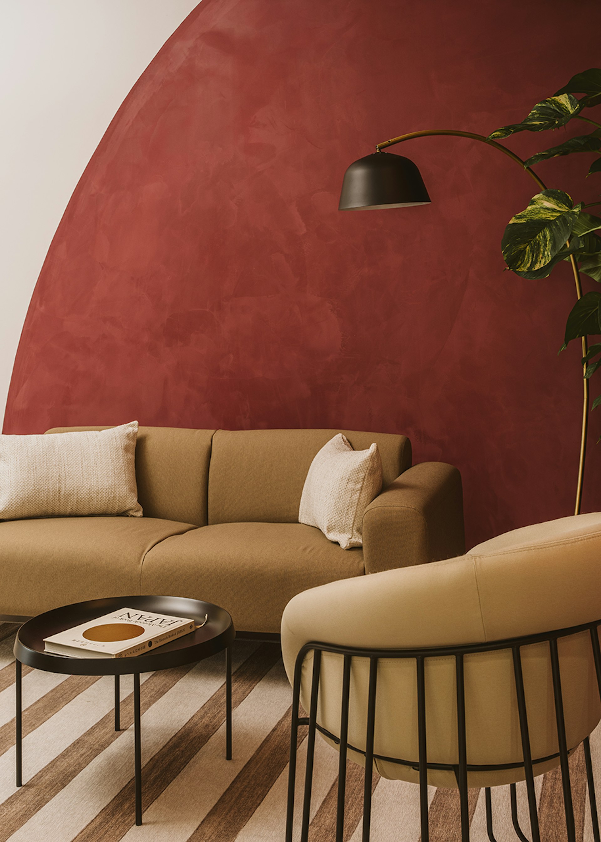
Drawing on the architecture of the building, we incorporated Art Deco motifs throughout but reinterpreted in a modern way. Our use of geometric patterns and vibrant hues invite energy and creativity, providing an environment that feels both inspiring and professional. This is especially apparent in the tea point, with a vivid burgundy, painted in a curved shape to ‘introduce’ the space. As you move into the main part of the tea point, this curved shape is continued with the inclusion of a curved ceiling feature. While this design feature was predominately included to maintain the circular motif, it also had a practical intention – the tea point originally had mechanical equipment over this area, making the area feel dark and boxed in. To overcome this, we dropped the ceiling and added this curved finish, alongside spotlights with a light, natural coloured paint, hiding the mechanical equipment while also adding a brightness to the area.
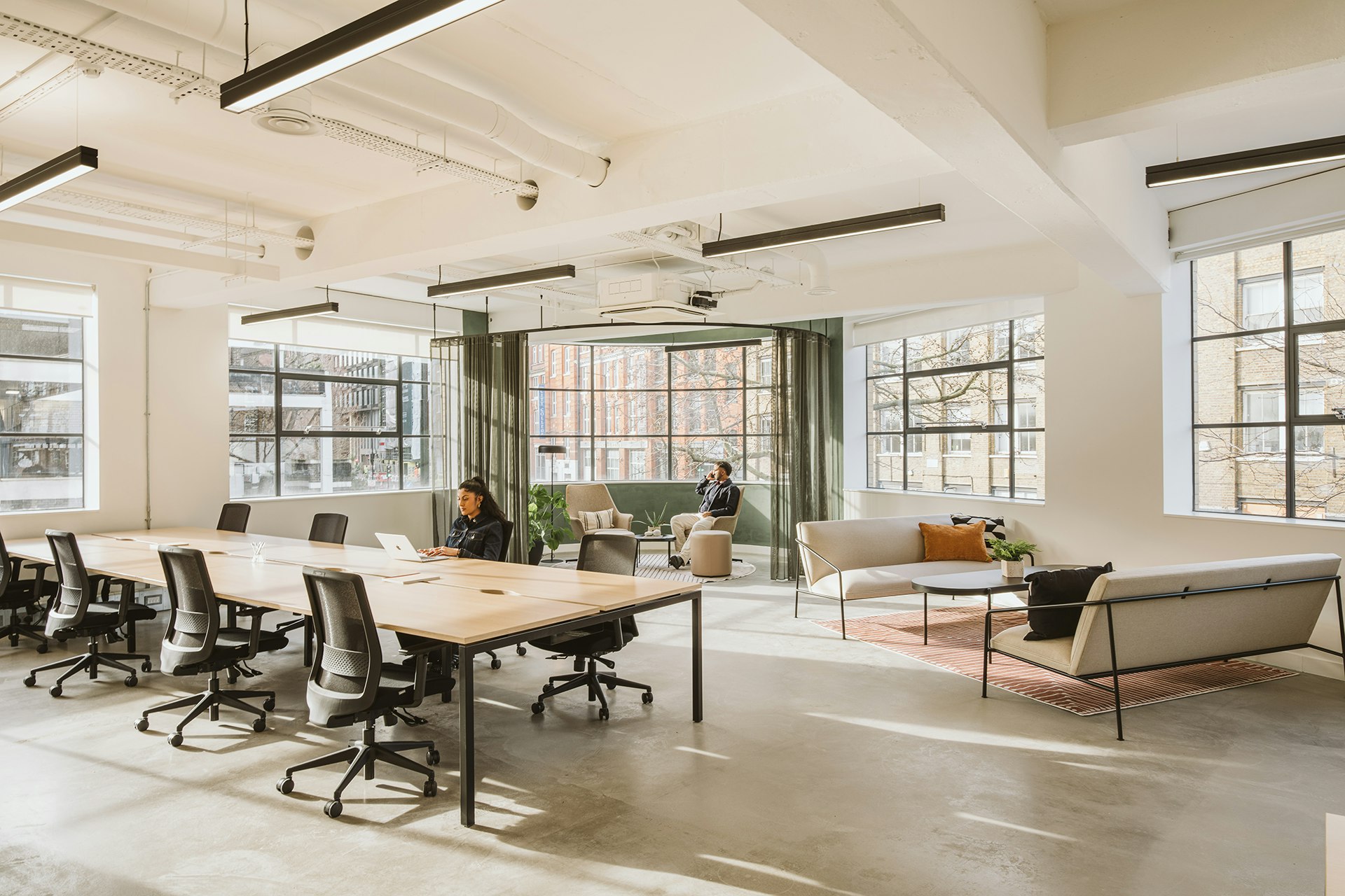
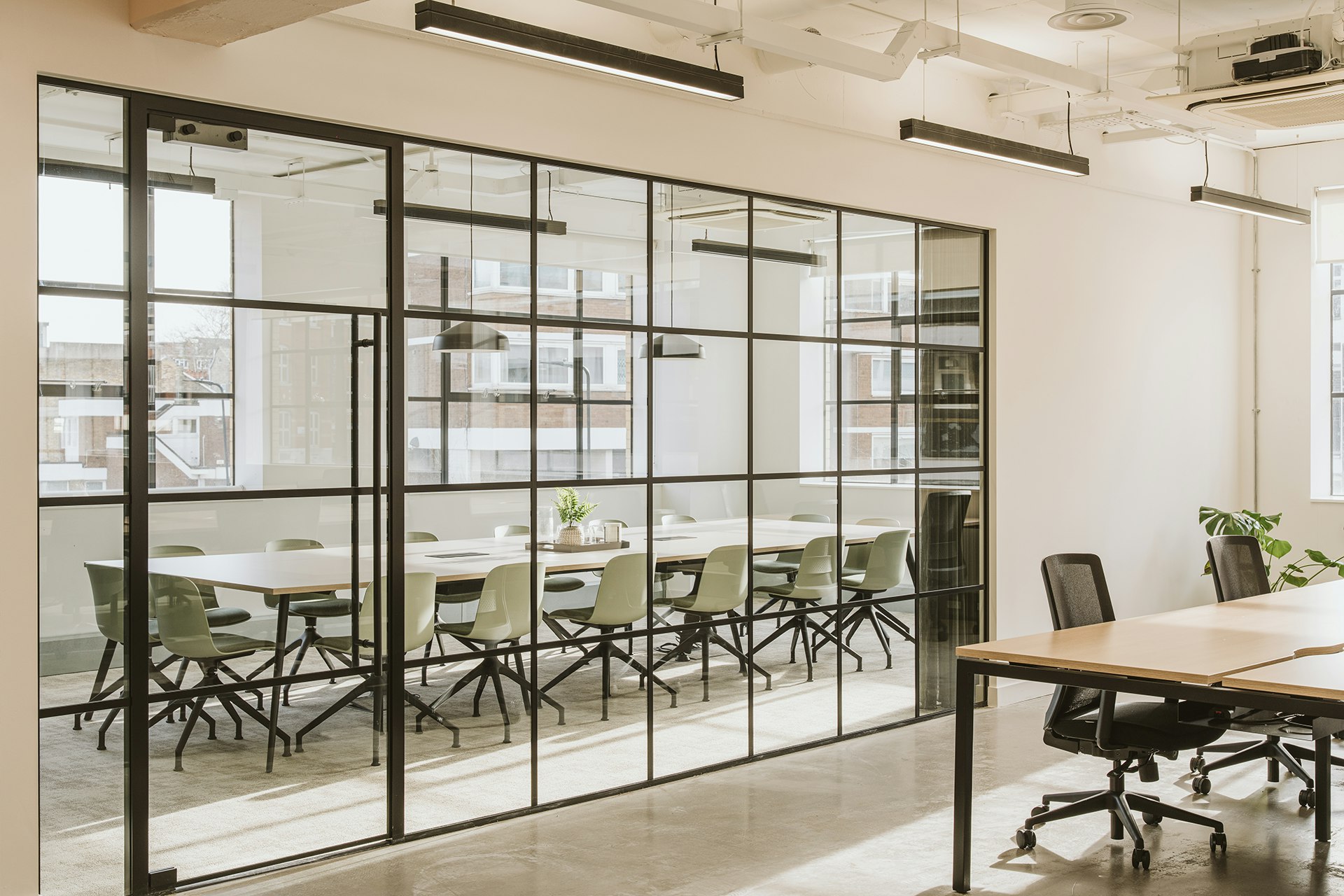
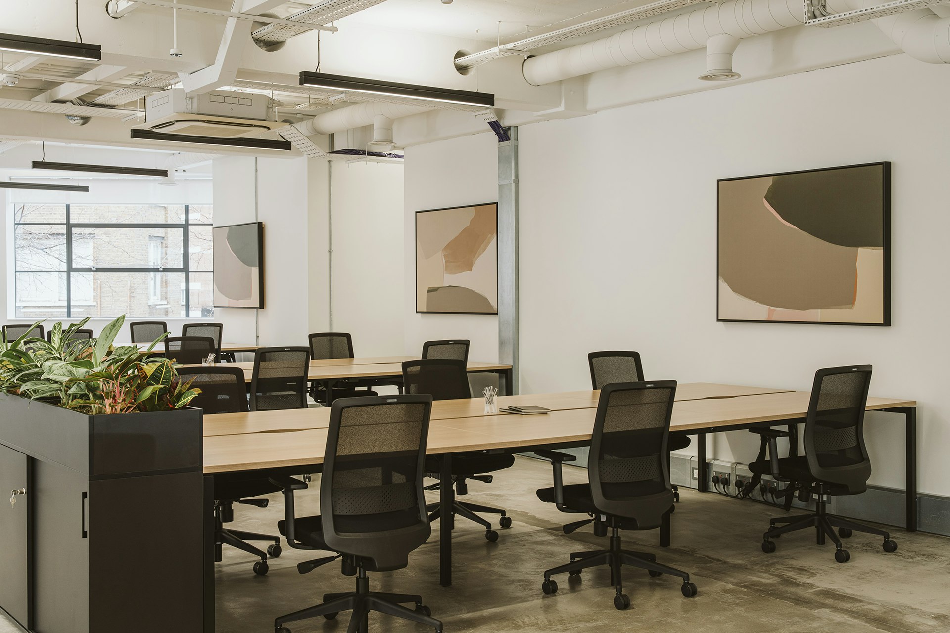
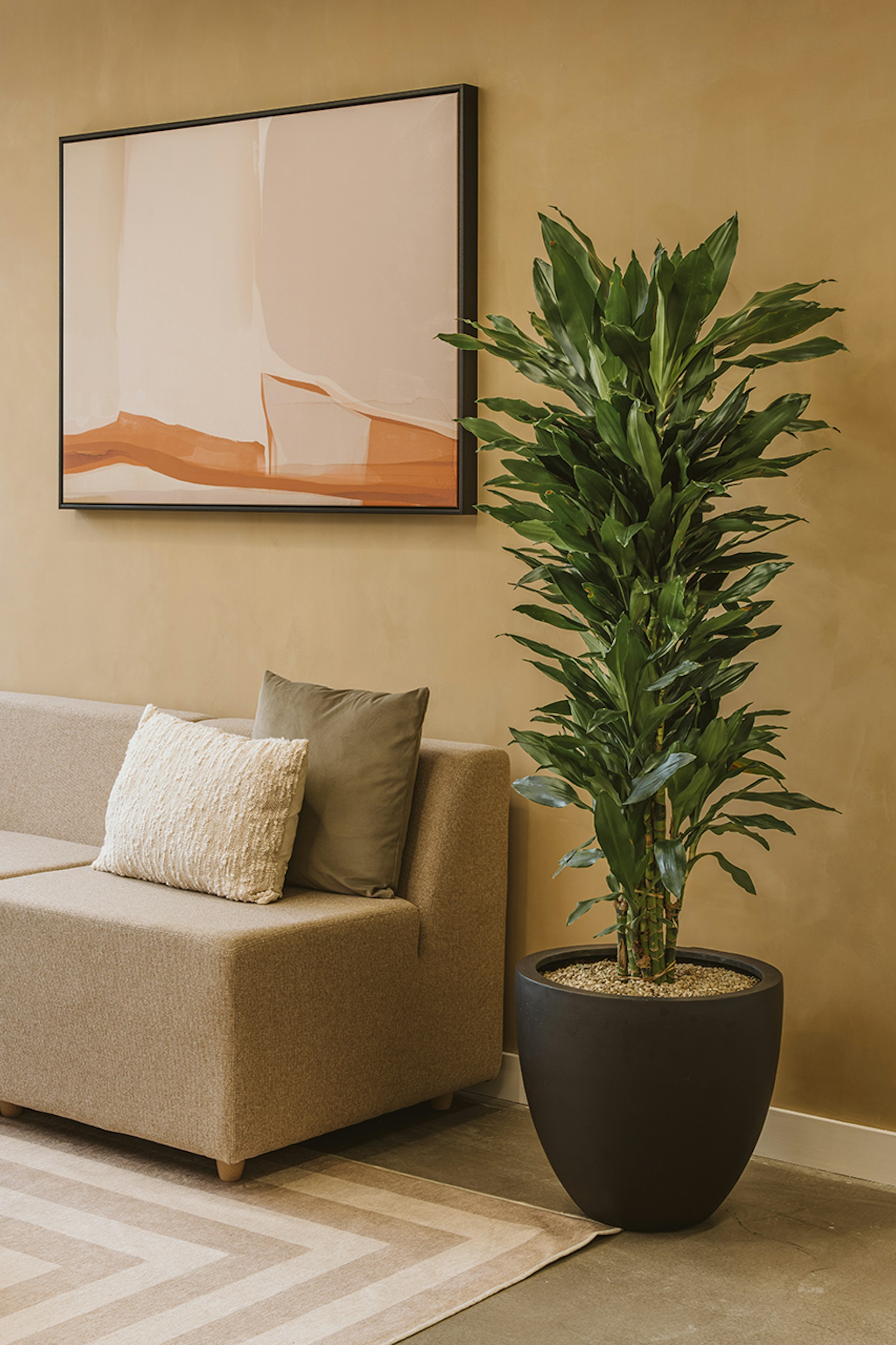
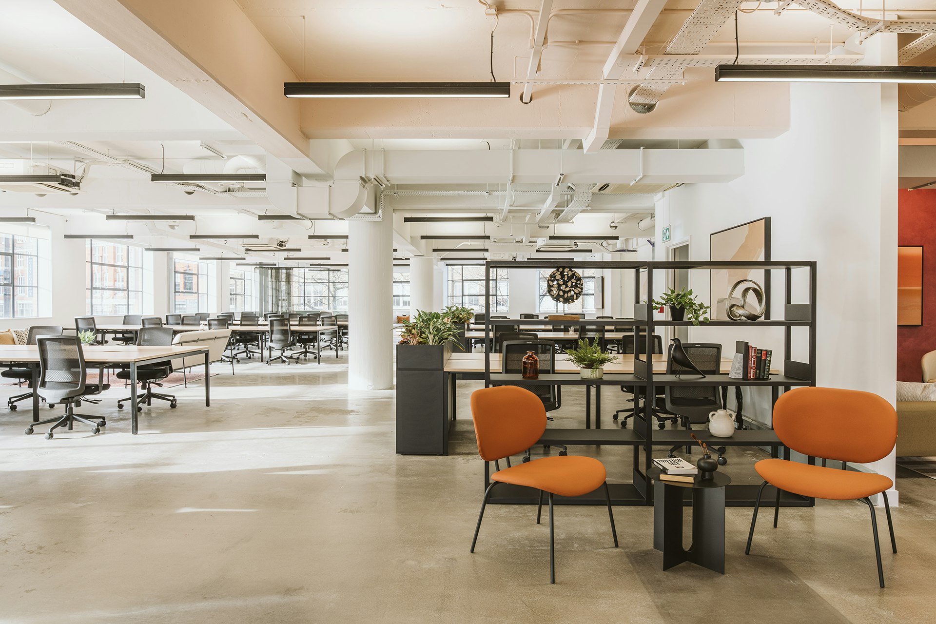
The colour scheme used in this project is arguably one of the standout elements of the space, with our choices throughout being both bold and sophisticated. We opted for vivid deep red tones that add energy to the space while incorporating calming forest greens, and neutrals to juxtapose this bold colour. The burgundy red cabinets in Tea Point were a collaborative choice made by both the designer and client, opting for this daring choice to add to the unique character of the space – this then influenced the vivid red limewash walls in the adjoining breakout area. To contrast against this vibrant colour choice, we opted for a more toned-down and soothing forest green in the main workspace and boardroom, ensuring that these areas were spaces which fostered a tranquil working environment. This fusion results in a space that is visually compelling and timeless.
While our choice of colour was distinct, we also emphasised texture throughout the space, using the raw texture and mood of the concrete flooring to provide a tactile contrast to the vibrant wall finishes and geometric patterns, creating striking visual harmony. These choices enhance the building's industrial charm and the trendy nature of the location while infusing it with a fresh, modern appeal.


Office’s should be more than just four walls, a ceiling, and some desk space.
With each and every project we redefine what make’s the workplace experience.
This website uses cookies
We use cookies to analyse the use of this website. For more information, see our Cookie Policy