
Situated off Oxford Street, 15 Rathbone Place sits among a mass of other Cat A+ spaces, each aiming to capture attention and stand out. However, using distinct features and the latest market data, we designed a space which breaks the mould of the ‘typical’ pre-fitted scheme.
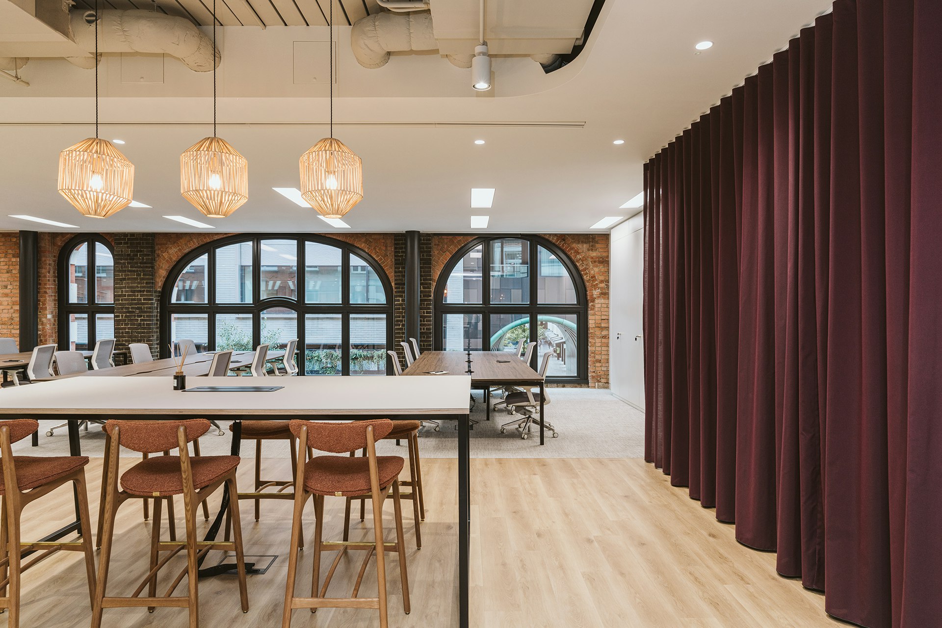
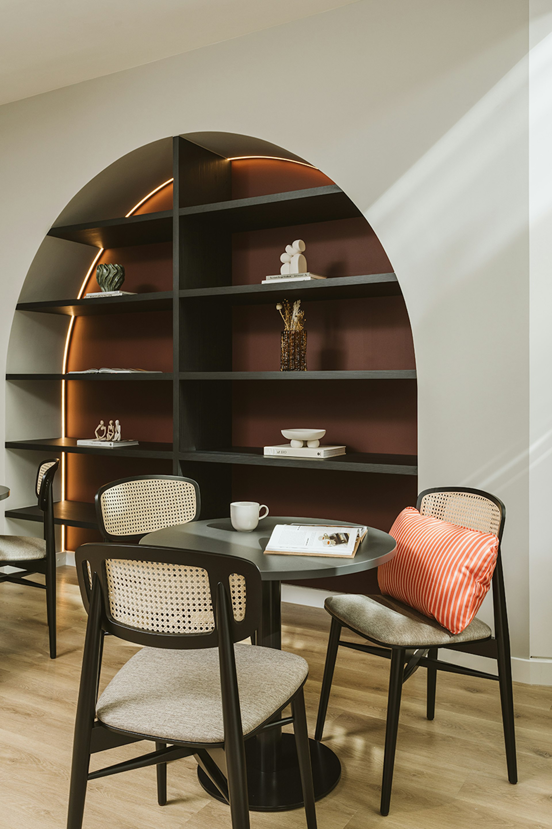
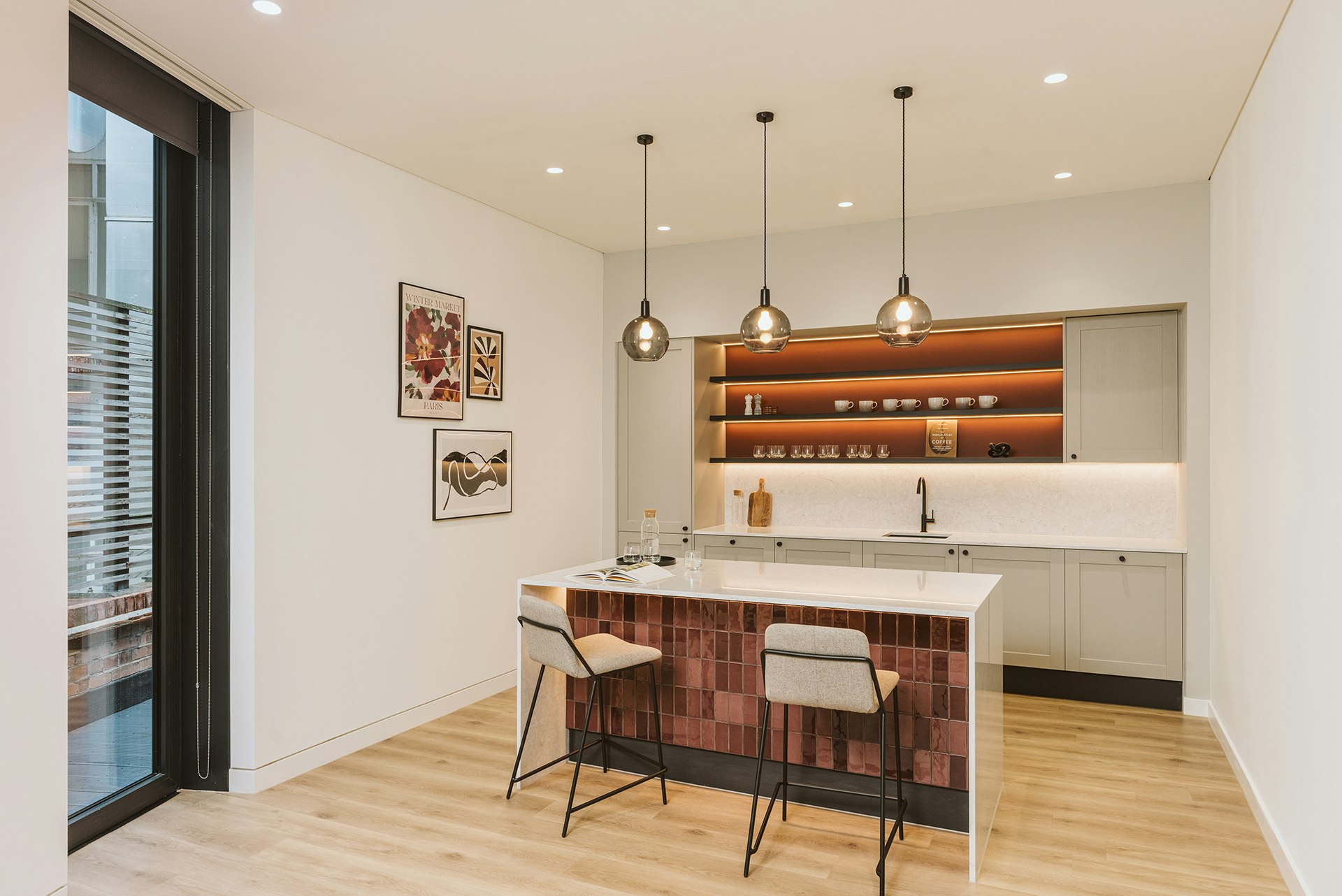
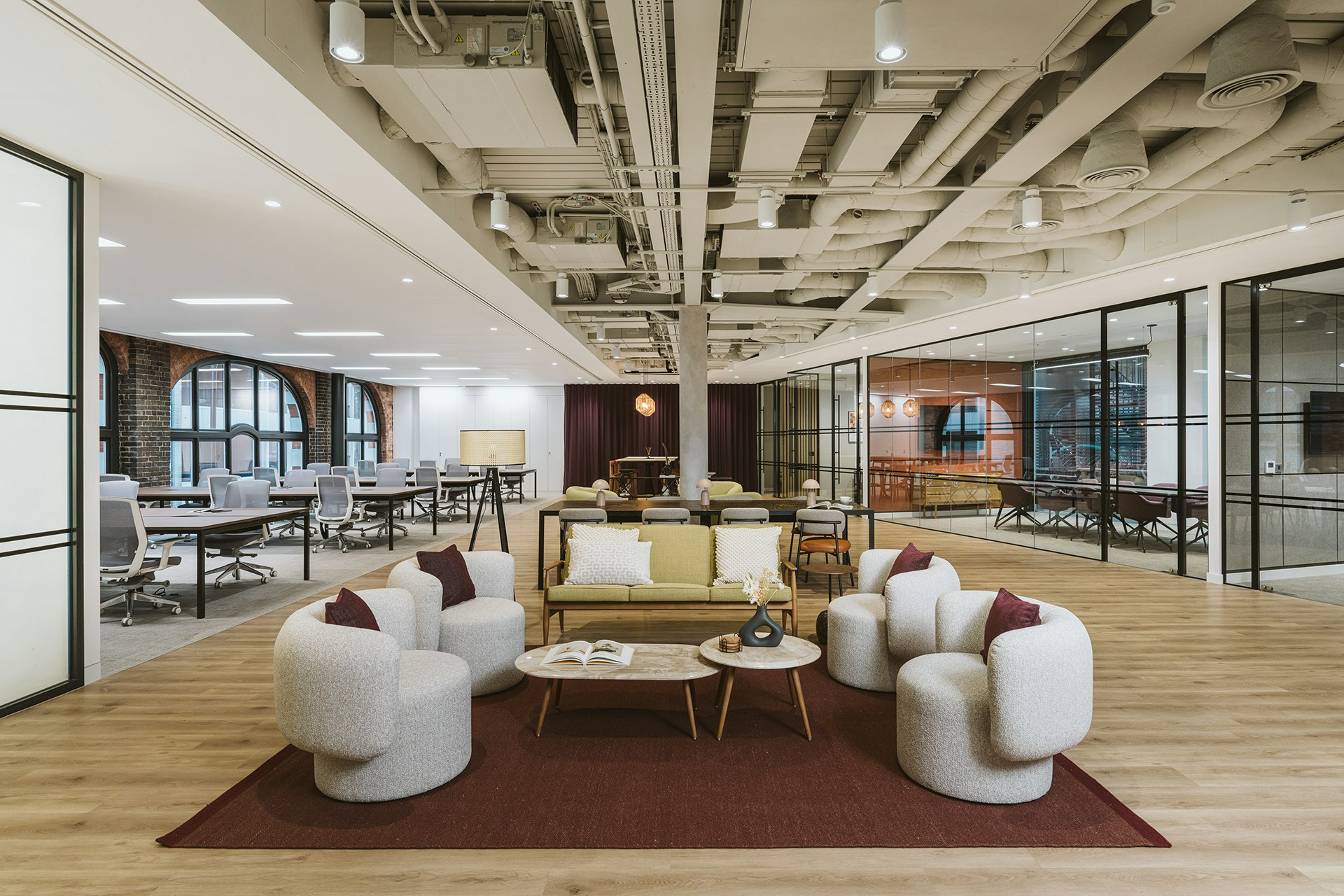
With raw natural materials, exposed brick and a central arched window, Rathbone Place is architecturally striking. When designing this space, we played up to and enhanced these features. The arched windows are a focus feature of this scheme, providing a centrepiece for the space. To carry this motif through to the interiors, we mirrored the bend with an arched shelving unit opposite the tea point. Alongside this, we chose rounded furniture with curved edges to replicate the curved arch, ensuring the design felt holistic and intentional.
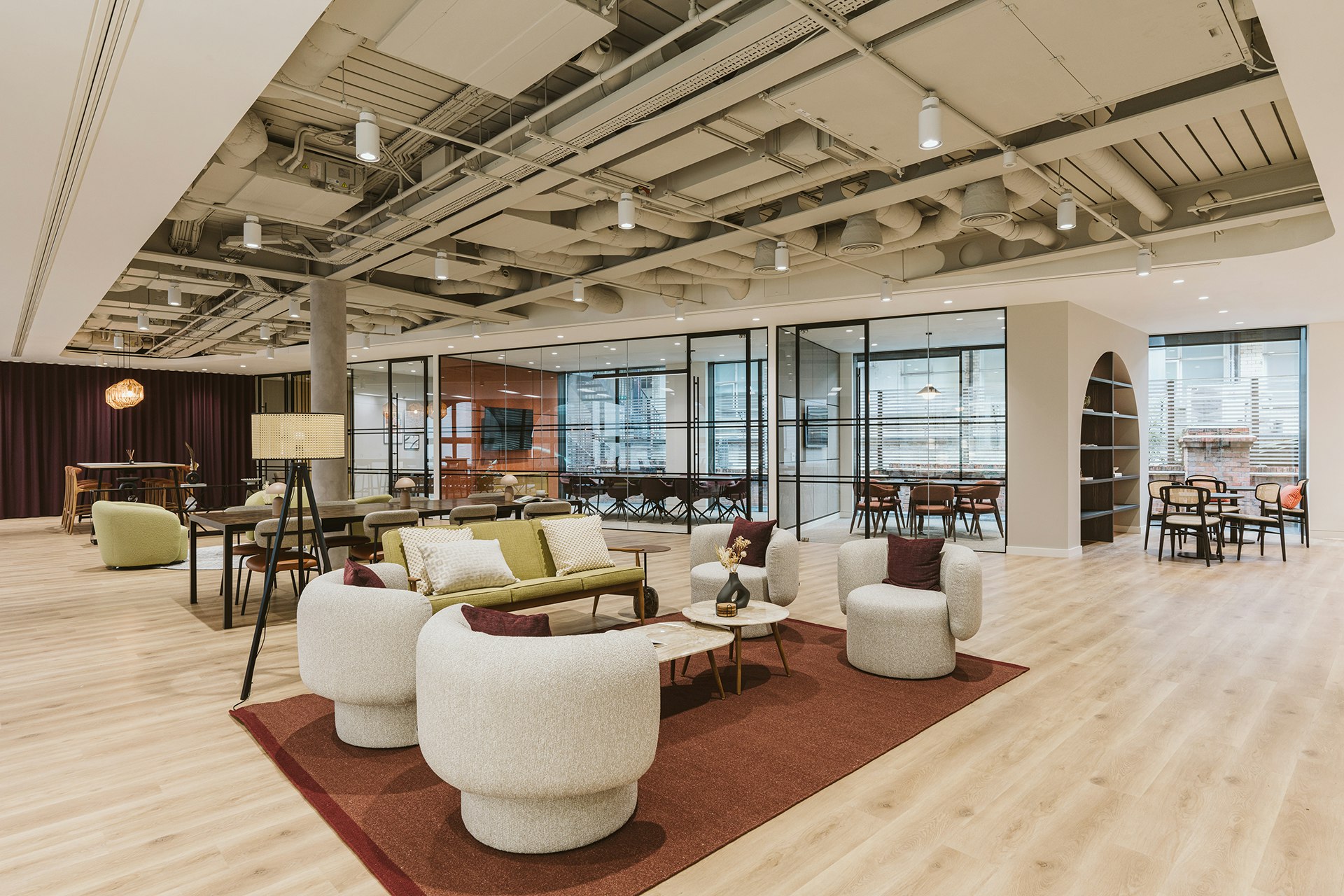
With a relatively small floor-plate, the client wanted to ensure the space felt open as well as being multi-functional. To achieve this, we kept the built elements on the far side of the space away from the arched windows, further allowing the feature to take the spotlight but also encouraging the centre of the floor-plan to be used as an informal workspace and communal area. Playing with heights in this area, we provided a space for every type of working need, be it a desk, library table, sofa or high bench. By including these varying work and social areas, this central area ensures functionality as well as dynamic design. To further the feeling of openness when you enter the space from the elevators, we sprayed the exposed ceiling, adding height and framing this area, which acts as a moment to connect between the meeting rooms and open plan.
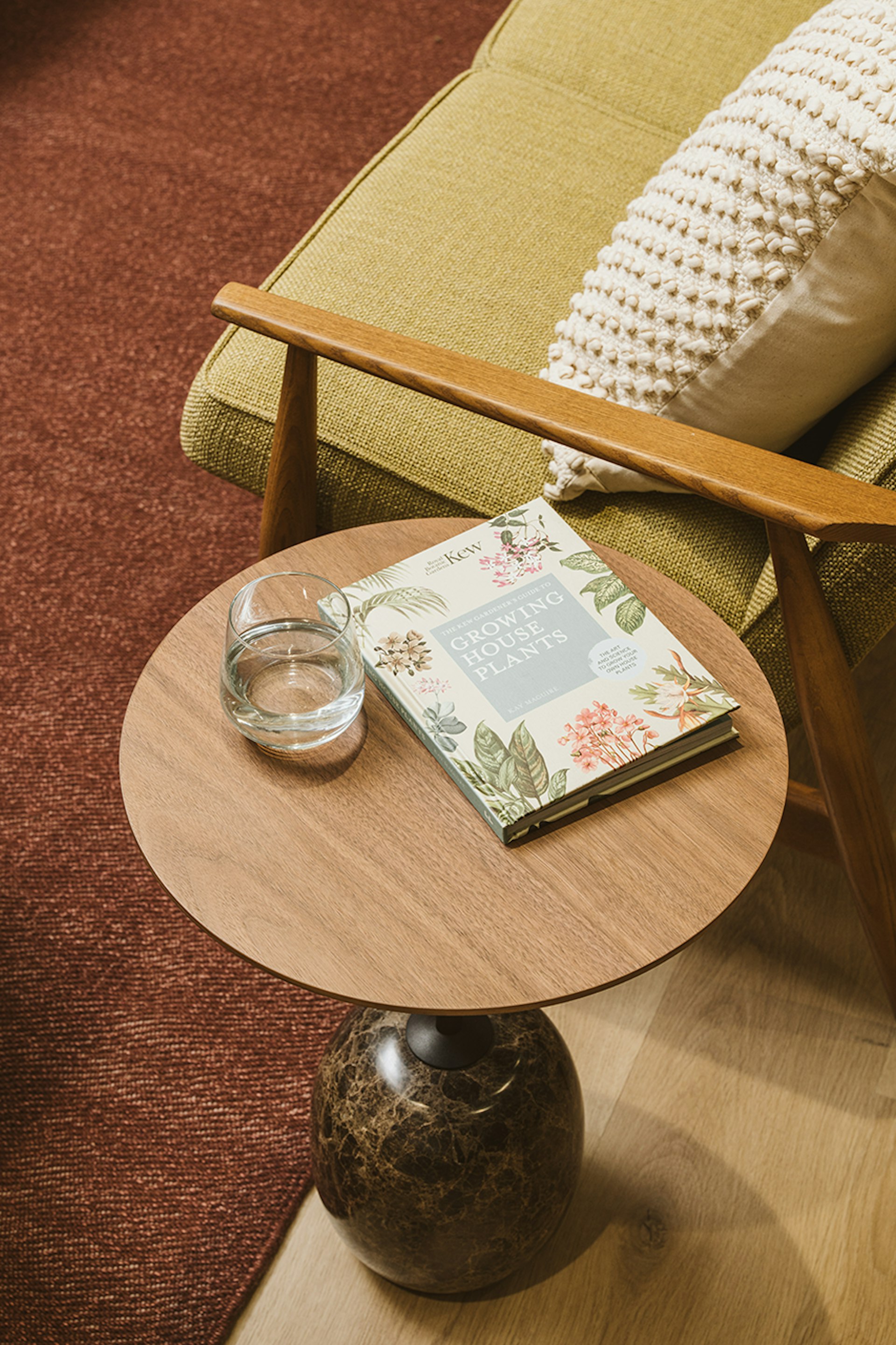
Taking inspiration from the exposed brickwork, we seeded rich maroons, plums and burnt oranges throughout the space. Although bold choices, these vibrant colours fit seamlessly into the scheme, matching the tonal hues of the brickwork. Strategic pops of chartreuse are provided from the furniture pieces, adding a freshness to the space and contrasting against the warmer tones. Alongside this, we selected high contrast colours for the tea point, with white counter tops, black finishes and deep purples and oranges to compliment. With bold choices and eclectic details throughout, this scheme stands out and offers a unique take on CAT A+ - elevating it above its competitors.


Office’s should be more than just four walls, a ceiling, and some desk space.
With each and every project we redefine what make’s the workplace experience.
This website uses cookies
We use cookies to analyse the use of this website. For more information, see our Cookie Policy